Burnie's Rock Shop Redesign

Burnie's current site is outdated, something you would have expected in the 90's. This site hard to use and not as organized as they would like to see for a local company that is so much cooler than they are leading on with their site.
While discussing Burnie's Redesign, Burnie's and I agreed that the logo and site needed an update. The website, to make them more relevant to their cliental as well as help boost their business with easier to use pages. Their logo, to bring them into the new era of design and usability.


While discussing the Burnie’s name and the vibes they should and could represent we chose calm, because nature can be calming, relaxing because they want people to feel comfortable using their site and find joy in what they are searching for, and fun because rocks, minerals, and gems can be fun for all ages.
I hope you enjoy these as much as I do.
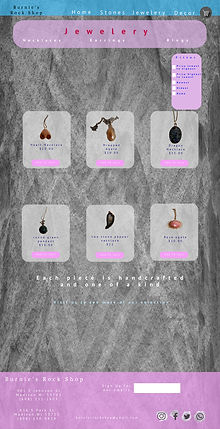
I took the photos myself and all I currently had was an old cell phone, so the quality was not as good as I had hoped. They could be way better photos but I think the concept is there. The Client and I didn't want all the pages to be the same background, we wanted people to enjoy the different textures that emphasize the many rocks, minerals, gemstones, and products available at Burnie's Rock Shop.
Software: Adobe Photoshop
In addition to the redesign, I tried to code some of the site
Skills: HTML, CSS, Flexbox
Programs: Visual Design Studio


